Oct 29, 2008

Who is your favorite artist?

0 Comments

The other day, a friend said to me "yes Jon, but who is an artist you actually like? Who is your favorite artist?" The remark came after I had spent five minutes deriding Air-Port-City, a work by Tomas Saraceno in the Psycho Buildings show at the Hayward (link).

Talking about art, it is easy to focus on the negative, the problems with a work or process. It is always safe to critique, complain, dismiss a work as too simplistic, too didactic, too utopian, too instrumental ... take your pick. Saying you actually like something is putting your head above the parapet - it is an invitation for someone to say "you like that? Isn't it too..."

Of course, my first response to my friends question was to say I don't believe in favorites and top-ten lists. That's all pop culture stuff.

At the same time, the question made me think back to a lecture by Pil and Galia at Goldsmiths.

The Goldsmiths MFA program has a weekly lecture series. In '07 Pil and Galia gave a memorable first lecture of the academic year. They decided to do a "top ten" list, going through a series of contemporary artists - ten they loved, ten they hated - and explaining why in each case. What started out as a serious academic survey of contemporary art practices quickly descended into farce. I remember at one point towards the end of the lecture, one of them clicked the next button on their slideshow, glanced at the image, said "too german," and clicked next again.

In the pub afterwards, many of the freshers looked quite confused - they came to a graduate art program and this was the level of discourse? A satire more biased than Fox News? What about all that criticality Goldsmiths is known for?

But the lecture was very considered. Through producing a moment of top-ten populism, Pil and Galia highlighted the entertainment aspect of art discourse, and showed there are no real authorities in art. Although there is a difference between an extended academic treatise and the simple phrase "too german", neither explains art. Don't come to an art degree program expecting answers.

Ooo, go on then. Francis Alÿs.

Oct 26, 2008

End of New Media at ICA

0 Comments

Ekow Eshun, Artistic Director of London's Institute of Contemporary Arts, announced last week that he plans to close the institution's "Live and Media Arts" department.

The ICA was a key center for early computer-based art, with its pioneering 1968 presentation Cybernetic Serendipity curated by Jasia Reichardt.

Eshun wrote an internal email about the closure that has since become widely circulated. It was the subject of this Blog post in the Guardian by Lyn Gardner. Gardner quoted Eshun's inflammatory remark that "it's my consideration that, in the main, the art form lacks depth and cultural urgency." Eshun was targeting new media, but Gardner suggested his comment was aimed at live and performance art as well. Eshun tried to qualify his statement with a followup comment, but too late. All are offended.

Eshun did display a lack of tact in his email. But I find myself sympathizing with his decision to close the department, though for different reasons.

Media-based categorization is less than helpful in art today. All too often these categories constuct walls rather than dismantle them. Medium-specificity was a modernist ideal, one of Greenberg's tenets. With all the changes in production methods, media categories have become increasingly blurred. Many artists have hybrid practices. There has also been an expansion of the forms and methods of art practice. As the curators of the Whitney 2008 Biennial write, "Today there are more artists working in more genres, using more varieties of material, and moving among more geographic locations than ever before." In other words, everything is more messy.

Schools and institutions need to adapt and shift their programs reflect this. Many are. For example, Goldsmiths last year folded its textiles program in with fine art, and renamed the department, from "Department of Visual Arts" to simply the "Department of Art". These kinds of changes are always disruptive. Hopefully, the new arrangement is also more open.

theanyspacewhatever

1 Comments
I just read a review by Kathryn Shattuck in the New York Times, Shining a Light On a Movement That Maybe Isn't, about a show opening at the Guggenheim (now through Jan 7) with work by the following artists:
  • Angela Bulloch
  • Maurizio Cattelan
  • Liam Gillick
  • Dominique Gonzalez-Foerster
  • Douglas Gordan
  • Carsten Höller
  • Pierre Huyghe
  • Jorge Pardo
  • Phillippe Parreno
  • Rikrit Tiravanija

The reviewer suggests that the show brings together a group of disparate artists. Shattuck quotes Mr Gordan, one of the artists, saying "none of us felt we were a group until the Guggenheim identified as a group." She writes that the "group identification took hold when Nancy Spector invited the artists to formulate a vision for an exhibition..."

The list of artists seemed vaguely familiar to me. So I cracked open Wikipedia, and read the entry for Relational art.

What these artists have in common is that they have all been curated together in group shows by the influential theorist Nicolas Bourriaud, under the label "relational art". The first such show was the Traffic show, in 1996, which presented Liam Gillick, Rirkrit Tiravanija, Philippe Parreno, Pierre Huyghe, Carsten Höller, Christine Hill, Vanessa Beecroft, Maurizio Cattelan and Jorge Pardo. Bourriaud has also written several books on relational art, including the widely read book Relational Aesthetics. The full list of artists mentioned on the Relational Art page are:

  • Vanessa Beecroft
  • Henry Bond
  • Angela Bulloch
  • Maurizio Cattelan
  • Liam Gillick
  • Felix Gonzalez-Torres
  • Douglas Gordon
  • Jens Haaning
  • Christine Hill
  • Carsten Höller
  • Pierre Huyghe
  • Jorge Pardo
  • Philippe Parreno
  • Rirkrit Tiravanija
  • Gillian Wearing
  • Andrea Zittel

Although Shattuck does mention that the artists had been involved in group shows together, there is no mention of relational aesthetics, or Bourriaud. This strikes me as revisionist. Are we to assume that appearing in group shows and being written about by Bourriaud for ten years under the label "relational art" was not enough to foster a group identity? But a group show at the Guggenheim changed that? I'm curious to find out more.

I must admit, I was also a tiny bit amused that artists who have been described as making "relational art", all about fostering relations between people, would, in the end, decide to make work as individuals for the show. Tiravanija is quoted as saying "It’s a kind of reluctant group show, because of the group itself." And Shattuck writes that Mr Gillick created "S-shaped benches that he sees as yet another metaphor, a glib one, for the show: people sitting together but facing in different directions, thereby eliminating the requirement to interact." Relational art might redefine the role between viewer and art, or between art and institution, but artists remain will always be artists!

Oct 25, 2008

Reductive art at P.S.1

1 Comments


Minus Space opening at P.S.1

Last weekend I attended the opening of Minus Space, curated by Phong Bui, at the P.S.1 Contemporary Art Center in Long Island City (October 19 - January 19). I had conversations there with artists Linda Francis, Billy Gruner and Simon Ingram.

It was my first encounter with Minus Space, a curatorial project based on the premise of reductive art. Minus Space was founded by Matthew Deleget and Rossana Martinez in 2003 (See www.minusspace.com for more). The show at P.S.1 is a collection of works by artists who are members of the Minus Space community.

Minus Space grew partly on the web, with artists submitting their work to the Minus Space website. Today Minus Space has a large number of members and they have now closed their online submission process. Many members run spaces or curate shows, and often work with each other. It is an amazing example of artists coming together and organizing through the web.

The work in the show resonated strongly with me. My own work takes up the themes of minimalism, and I felt a visceral connection to much of the work in the show.

However, I was left wondering about the organizing principles behind the show. What makes a "minus space" artist? If Minus Space were a club, would I want to be a member?

Matthew Deleget, in an interview reproduced in the P.S.1 newsletter (link), says Minus Space is a presentation of reductive art:

"Reductive art is generally characterized by its use of plainspoken materials, monochromatic or limited color, geometry and pattern, repetition and seriality, precise craftsmanship, and intellectual rigor."

I find this a puzzling way to characterize an art movement. Of the listed qualities, only "intellectual rigor" escapes being about what an object looks like or how it is made. I could as well start a collective for Pinkish art, characterized by smooth materials, pink color, circles and paisley, hand-made craftsmanship, and intellectual rigor - all but the last of these describes my shirt. My point being that it is futile to define a mode of art by talking primarily about what it looks like.

What Matthew's characterization leaves out is any mention of intent. Why use plainspoken materials, or limited color? What is important about repetition or seriality? In the interview, Matthew stresses that reductive art is, without question, still relevant and legitimate today. But he leaves it for the reader to guess any of the goals or intentions behind reductive art.

This is surprising, given the clear formal connections between Minus Space's "reductive art" and minimalism. The early minimalists had extremely strong intention claims surrounding their work. Sol LeWitt, for example, talked about being anti-emotionalism, about concept-driven art. In Artforum in 1967 (link) he wrote:

I will refer to the kind of art in which I am involved as conceptual art. In conceptual art the idea or concept is the most important aspect of the work. When an artist uses a conceptual form of art, it means that all of the planning and decisions are made beforehand and the execution is a perfunctory affair. The idea becomes a machine that makes the art. This kind of art is not theoretical or illustrative of theories; it is intuitive, it is involved with all types of mental processes and it is purposeless. It is usually free from the dependence on the skill of the artist as a craftsman. It is the objective of the artist who is concerned with conceptual art to make his work mentally interesting to the spectator, and therefore usually he would want it to become emotionally dry. There is no reason to suppose, however, that the conceptual artist is out to bore the viewer. It is only the expectation of an emotional kick, to which one conditioned to expressionist art is accustomed, that would deter the viewer from perceiving this art.

There is no mention here of the material qualities of the work. LeWitt's intention-based definition is powerful precisely because it defines a method for generating art. It in no way offers a prescription for how to recognize work that is created following this method - there is no visual category for LeWitt's art. What is characterized is process, not output.

The curious omission of intentionality in Minus Space's definition of reductive art could, perhaps, be read as a retreat from the idealism of the sixties, when many believed art could actually do something. After postmodernism we lost this kind of idealistic commitment. Perhaps today, and given the plurality of art practices, there is more of a case to be made for defining art movements in terms of appearance or craft?

I don't accept this. I just started reading Jörg Heiser's "Things that matter in contemporary art". It gets off to a good start when Jörg argues that, "for contemporary art, the emphasis has shifted from biography and medium to method and situation." The focus in the book is on the collision between ideas, attitudes and methods. Like LeWitt, Jörg focuses on the intentions used to generate work, rather than trying to define an ontology based on formal qualities. This makes sense.

In my own work, for example, I sometimes use figurative elements. I recently drew a series of ice cream cones. I view this as blatant figuration: I am less interested in figuration to depict symbolic references than as a way to show that figures, too, are composed of line and shape. At this level, abstract and figurative images are equal. If I draw a squiggle or a chicken, both are products of the hand. Repeating a figure many times emphasizes this common graphism.

Does that mean that, because I use figurative elements, I am not a "reductive artist"? Certainly, none of the artists on the Minus Space website show pictures of chicken or ice creams!

Yet I feel that my own art is very much linked to minimalism. I share an interest in immediacy, in concept and process, and in permutations. Where I move away from minimalism is my sense of the ridiculous. The second chapter in Jörg's book is titled "Pathos versus Ridiculousness: Art with slapstick". I am excited to read this. Last year in an essay I wrote about rubber chicken theory, about the importance of nonsensical elements in art.

Elements of ridiculousness were present at the Minus Space show. The curator Phong Bui had a great sense of humor in the way he juxtaposed certain works. I remember an embroidery pile on the floor and a sculpture of a dustbin by Michael Zahn - both pieces seemed out of place in a funny way, oddly recognizable among the abstract paintings. (The works had no labels, making it hard to determine the artist's names). And several artists picked up on the theme of absurdity. Simon Ingram created a painting machine out of lego. What I liked about this work was the kind of pathos it generated as the lego arm moved chunkily over the canvas. If the machine had emphasized craftsmanship, it would have been too ernest, it would not have captured my attention.

I left the show feeling very grateful that I had been introduced to Minus Space. And afterwards, talking with Linda Francis and Billy Gruner, I realized Minus Space is not a club or a movement to accept or reject. It is a community, a group of artists with diverse backgrounds who have come together to share and discuss and carry forward the dialogue.

Oct 21, 2008

Governors Island Art Fair

0 Comments


Self portrait in Shelby Voice's installation at the Governors Island Art Fair

I went to the first annual Governor's Island Art Fair on October 12th. It was the last day of the fair, I'm glad I made it. The event was organized by the artists collective 4heads.

I uploaded some photos on my Flickr stream.

I didn't sense any particular curatorial thrust to the work, it was a bit of a random collection. And the ubiquitous price lists and "For Sales Inquiries Please Ask ..." in every room detracted from the work, giving the show a tag sale atmosphere. I think this was unfortunate - the show could have benefited from a higher level structure.

That said, I thought the range of work was impressive, much better than some "me and my friends" style shows I have seen. It was cool to see an artists-organized fair in the city, rather than some sponsored-to-the-hilt commercial fair. And Governors island is stunning. I plan to go back next year.

Oct 20, 2008

Serious about tea

0 Comments

This story by tea shop owner Imen shows how far some people will go for a cuppa!

Oct 19, 2008

Olaf Breuning at Metro Pictures

0 Comments
I just visited Olaf Breuning's exhibition at Metro Pictures (519 West 24th street, 11 Oct to 8 November, see here). It is hilarious. Like David Shrigley, he uses humor in most of his works, but his humor tends to be more biting and his drawing style is very exacting. It is the kind of work resuscitates my desire to make art. His website, www.olafbreuning.com is worth a visit too.

Oct 18, 2008

Whitney Biennial 2008

0 Comments

[published in ArtArtArt magazine, issue 3]
Whitney Biennial 2008
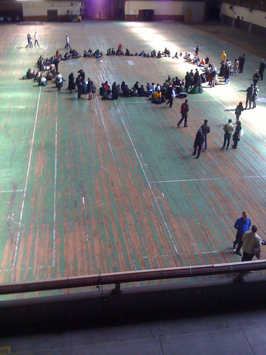
The Armory building during the Whitney Biennial, photo by Jon Meyer - see this Flickr Set for more photos

Park Avenue Armory, New York 6 March – 1 June 2008

Entering the Whitney Biennial 2008 at the Park Avenue Armory, I overheard artist Fritz Haeg speaking to a group sitting on the floor: “I want the piece to be as live and ephemeral and immaterial as possible”. He was referring to his upcoming ‘Animal Drills’, a performance in the drill hall, with dancers performing animalistic movements.

Haeg’s dismissal of materiality is a theme repeated throughout the Armory portion of the Biennial. Indeed, material gestures were so sparse I was surprised when I encountered a room upstairs containing a large cloth tent, sewing machine, large flag bearing a red cross, bars of wax, and army cot beds. Could this be a remake of some Joseph Beuys myth? The thrumming synth background music says not. For ‘Triage’ (2008), DJ Olive intended the beds as places to relax while listening to music. During my stay, one art viewer took up the invitation, collapsing on a bed and closing his eyes. His action illustrated that the beds are not material symbols or mythical sculptural forms. Instead, the message is: kick back, take the weight off, enjoy.

For his piece ‘In the beginning...’ (2008), Bert Rodriguez created a room within a room. It is a small and well furnished white cube. It looks like a waiting room of sorts: clock; two chairs; coffee table. Set in the Armory, I thought of the intersection between bureaucracy and war, of civil servants at home waiting to hear news from the front. But again the objects served a dual purpose, downplaying their symbolic status: Rodriguez used the space during the event to offer daily talk therapy sessions. Art as therapy.

Ties of Protection and Safekeeping (2008) - MK Guth Collection of the artist; courtesy Elizabeth Leach Gallery, Portland, and Whitney Museum of American Art

In ‘Ties of Protection and Safekeeping’, MK Guth created one of the most visually arresting installations – a transportative room, filled with braided artificial hairpieces and red felt, reminiscent of Tibetan prayer flags. To assuage any concern we might have for this material investment, Guth asked visitors to help braid the work, and to write answers to the question “What is worth protecting” on the cloth strips. The responses were predictably banal, hardly worth protecting: “Art, peace, psychadelics” wrote one. “Catties are god’s kids” said another.

In ‘Our Hour: Radioff’ (2008) Bozidar Brazda hung a metal chair from the ceiling using cables, upside down. The shiny metal looked out of place in the dusty rooms of the Armory, and again I thought of the military, of waterboarding, torture, being suspended upside down. The sounds from a speaker at the back of the room seemed to reinforce this impression, but the descriptive text focused instead on a microphone placed in the room, apparently to pick up ambient sounds from visitors, challenging the definition of “live” radio. During my visit, the microphone seemed to be off.

So it goes on. Ellen Harvey drew fifteen minute portraits of one hundred visitors, and had the sitters fill out a survey questionnaire - harmless pictures and text. Mario Ybarra showed a collection of Scarface memorabilia, making certain to invite visitors to donate new memorabilia to the collection. Eduardo Sarabia made a beer bar open on certain nights. When the bar is not in use, we are instructed to view it as a sculpture. During my visit, the sculpture was covered in empty plastic bottles, echoes of the previous night’s consumption.

Unifying all of these works is a common theme – a theme that Nicolas Bourriaud best described in his influential 1996 book Relational Aesthetics. These are artworks meant to be judged not for their material qualities, but according to the inter-human relations which they represent, produce, or prompt.

However, as Claire Bishop says, in her article Antagonism and Relational Aesthetics (2004), “if relational art produces human relations, then the next logical question to ask is what types of relations are being produced, for whom, and why?” This is a question we are left to ponder at the Armory portion of the Whitney Biennial.

I could not help but notice the few objects unquestionably present for themselves. For example, Garrdar Eide Einarsson’s ‘Black Suit (Sic Semper Tyrannis)’ 2008 is a black suit in a frame. It speaks of uniforms, of wearing black suits on days of mourning. Yet the descriptive text for this work indicates it, too, has a social explanation. It refers to Abraham Lincoln’s assassination, an event that converted Tom Taylor’s play into a densely relational moment.

Still from Silent Film of a Tree Falling in the Forrest (2005-6), Mungo Thomson Courtesy of the artist

The Grand Machine/Theorola (2002) Jason Rhoades, Courtesy of the artist, Galerie Hauser & Wirth and David Zwirner

Throughout my visit, the Armory building continuously asserted itself. At the very back of the hall, tucked away in a room easily missed, was a film loop by Mungo Thomson, ‘Silent Film of a Tree Falling in the Forest’, (2005-06). The film is slightly sentimental in a way that could easily irritate me in another context. But while watching the trees falling, I glanced out at the empty cavernous Drill Hall. Its wooden floor shows scars of a century of hard use, and I thought about how many trees were felled to make that hall. I experienced a chilling sense of awe, fear and wonder. The Armory is its own testament to the huge material consequences of our very non-ephemeral nature. However, this juxtaposition of the Armory with the anti-material art within it went largely unacknowledged.

Later, I visited the Whitney’s Breuer building on 75th Street, to see the rest of the Whitney Biennial. Here, relational aesthetics are quietly put away. Objects are allowed to speak for themselves again. Jason Rhoades’ ‘The Grand Machine / Theorola’ (2002) is a good example. A chaotic mound of objects, each numbered and labeled. The piece depicts a factory production line gone mad, and I think of the production line surely needed to reassemble this piece. It is unashamedly lush, excessive. In his installation, we are not invited to participate in some pseudo-democratic process. Quite the opposite. This party has already happened. It’s over. Only a tiny number of people were cool enough to be invited. The rest of us are left, instead, to feast on the visual remains. In ten minutes, I realize I am full.
Oct 12, 2008

Oct 6, 2008

Obama Shnitte

0 Comments

Street vendor sign from July 24, 2008, Berlin.

I'm riveted by the election.

This article on the culture wars is a really good summary of the ideological differences between the two parties.

It is looking more and more likely that Obama will win. Which is a good thing for artists. McCain has shown very little interest in continuing arts funding.

Leaving Pine Plains

1 Comments

It was my last day in Pine Plains, New York, today. Driving out of town, I saw this "restoration in progress" sign. Honest! I had to stop the car and go back to snap the photo.

I liked this little town in upstate New York. Pine Plains is still a "real" town, with a handful of good shops and a feeling that simple things still matter.

Oct 3, 2008

chashama North in Fall

0 Comments

Here are some photos taken at chashama north (click to enlarge):

Oct 2, 2008

New York City term limits

1 Comments
Regarding Bloomberg's push to overturn term limits for elected officials: I'm in favor of abolishing term limits, but only if Bloomberg also forgoes using his private wealth to run his election campaign. Any legislation to remove term limits should also mandate that officials seeking a third term must use the city's public finance system for their campaign. That would ensure officials stay in office because of their record, not the size of their wallet.